
Case Study
“oh my gosh sorry i totally
forgot to respond!”
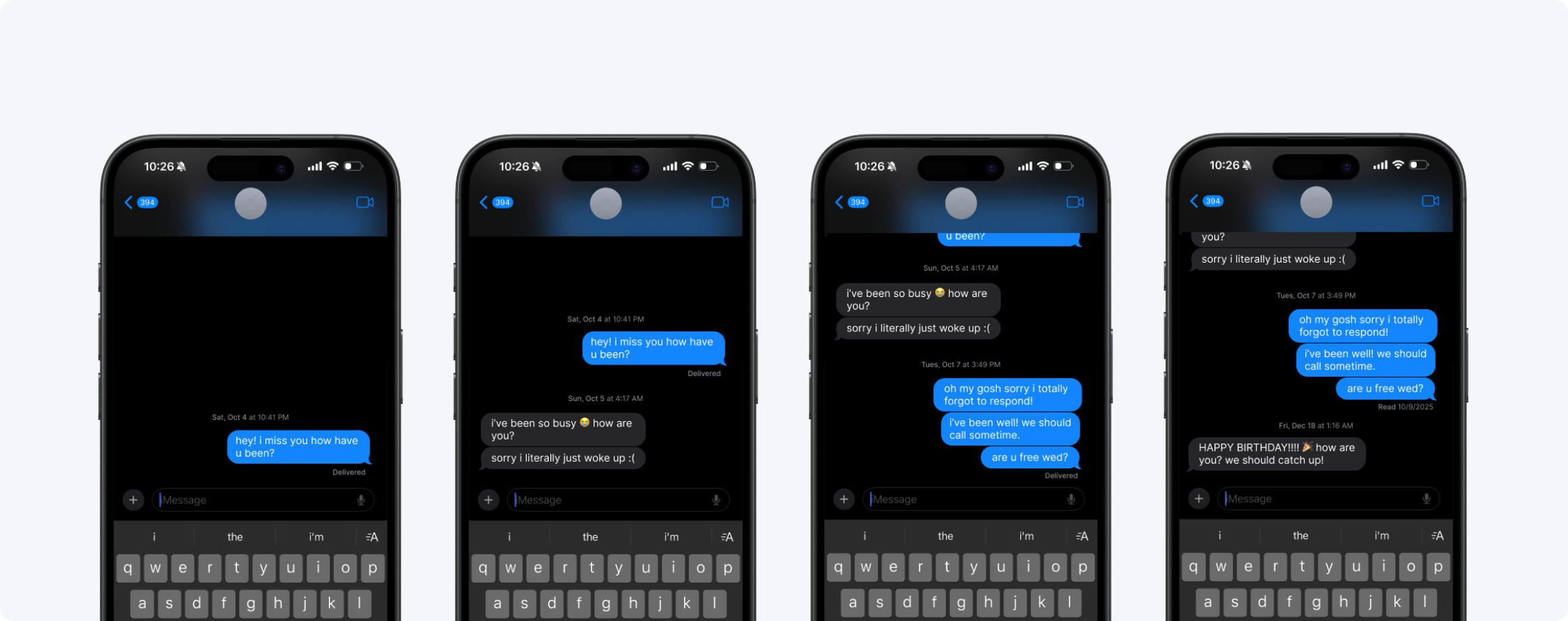
Both people miss each other. Neither person is doing anything wrong. The tool just wasn't built for this.
Long-distance relationships don't fall apart from lack of love — they drift from the friction of reaching out. Missed windows, timezone gaps, messages that imply replies no one has the bandwidth to send.
Lumo is a paired desk companion and mobile app designed to keep long-distance loved ones feeling close — through ambient light, proximity sensing, and shared voice notes. Built at CMU for Playful Interaction Design.
Role
Lead Mobile Designer
Team
3 Designers
Deliverable
App + Physical Prototype
Key Skills
Interaction Design · Physical Computing · Mobile Design
Working in a team of three — Manya Bhogilal, Zeana El-Hajomar, and myself — we were asked to design a playful interactive system that addressed a real human need. A shared thread kept surfacing in our early conversations: we were all far from people we cared about. Zeana and I are in different time zones from close friends and family. Manya had been thinking about the friction of asynchronous relationships. We started there.
HMW Question
“How might we recreate the feeling of embodied co-presence between long-distance loved ones?”
01 · The Problem
Messaging apps treat presence
like a transaction
The friction isn't emotional — both people clearly want to connect. The friction is structural. Every message implies a reply. Every reply requires the other person to be available, present, and in the right headspace to respond. Across timezones and full lives, that window almost never lines up.
01
No ambient awareness
You don't know if they're awake, at their desk, or on the other side of the world in the middle of their night. Timezone math is exhausting and easy to forget.
02
Every message demands a reply
Text threads are inherently conversational. A message implies a reply. That pressure erodes casual, low-stakes reaching out.
03
No record of presence
You don't see the pattern of when they're around. Each interaction lives in isolation — there's no shared rhythm visible to either person.
02 · Research
What already exists —
and why it falls short
Connection treated as an event, not a state.
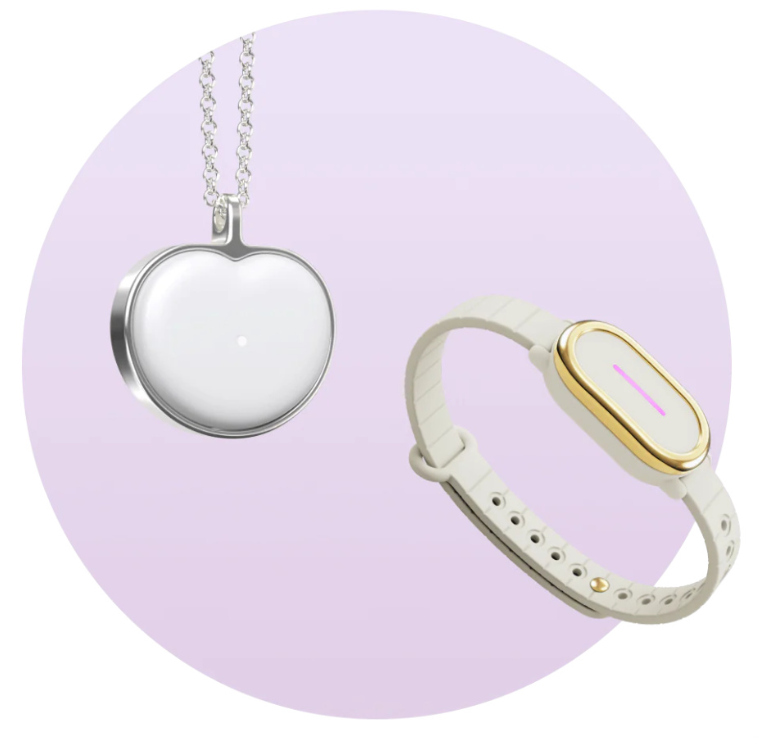
BondTouch
Wristband that sends touch vibrations. Single-modality. Requires deliberate action to initiate every time.
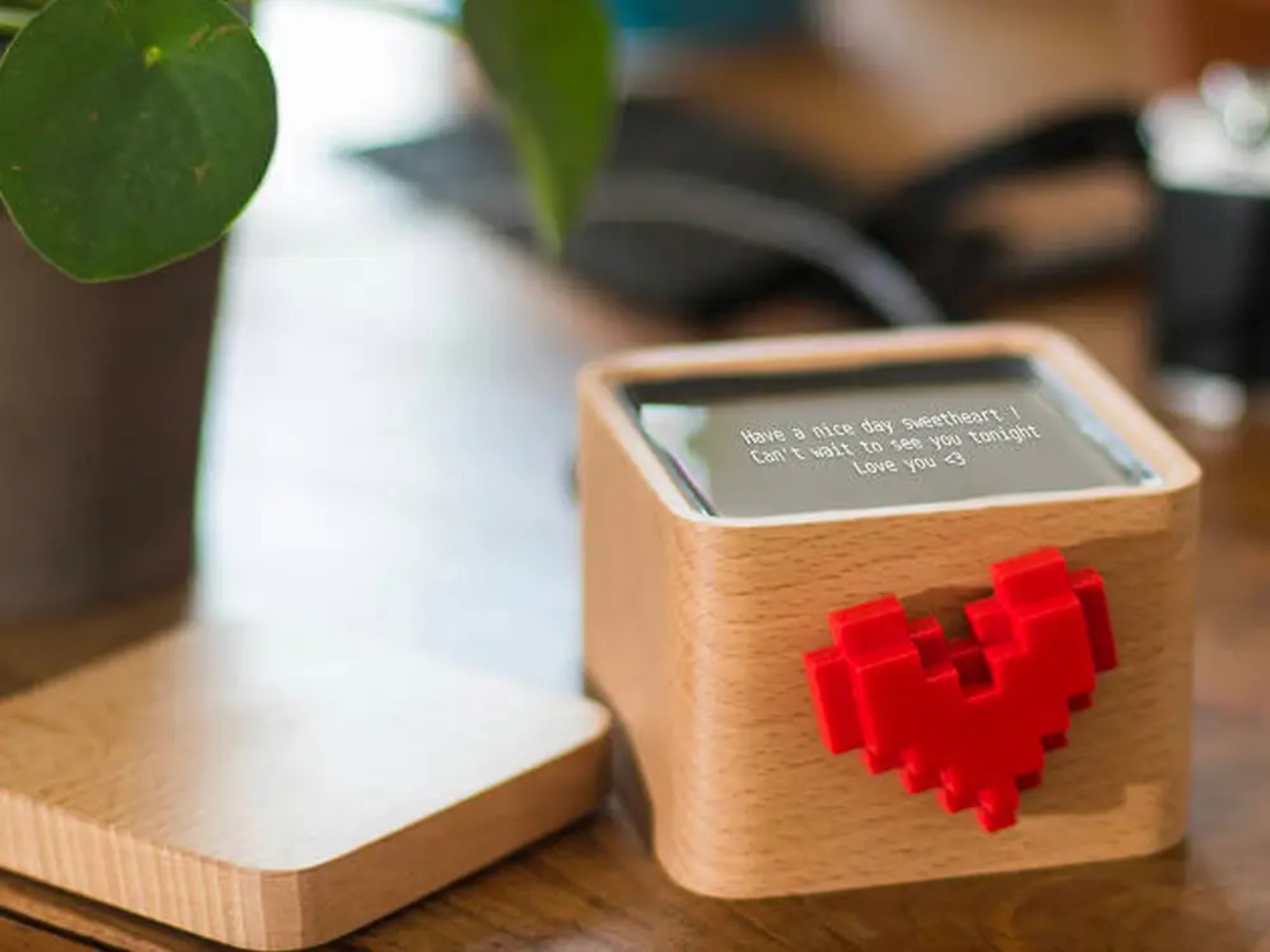
LoveBox
Heart spins when partner sends a message. Charming, but requires the sender to pull out their phone and actively compose.
Insight
One-channel devices feel limited
Implication
Multi-modal cues: light, proximity, warmth, sound
Insight
Users value ambient presence
Implication
Automatic cues that run throughout the day without user effort
Insight
Micro-gestures create connection
Implication
Small, lightweight, optional interactions — not obligatory rituals
Insight
High setup cost kills daily use
Implication
Interactions must be intuitive and nearly zero friction
Insight (Problem)
Design Implication
One-channel devices feel limited
Multi-modal cues: light, proximity, warmth, sound
Users value ambient presence
Automatic cues that run throughout the day without user effort
Micro-gestures create connection
Small, lightweight, optional interactions — not obligatory rituals
High setup cost kills daily use
Interactions must be intuitive and nearly zero friction
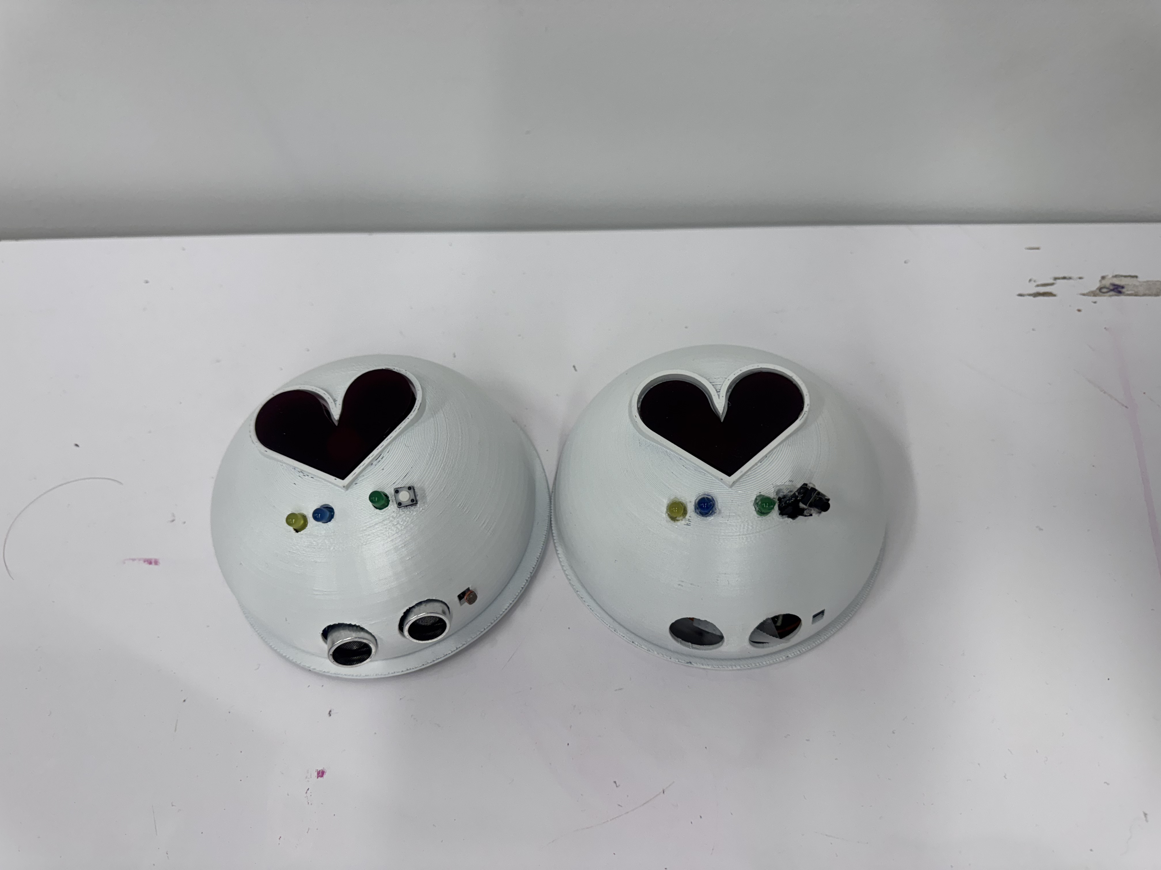
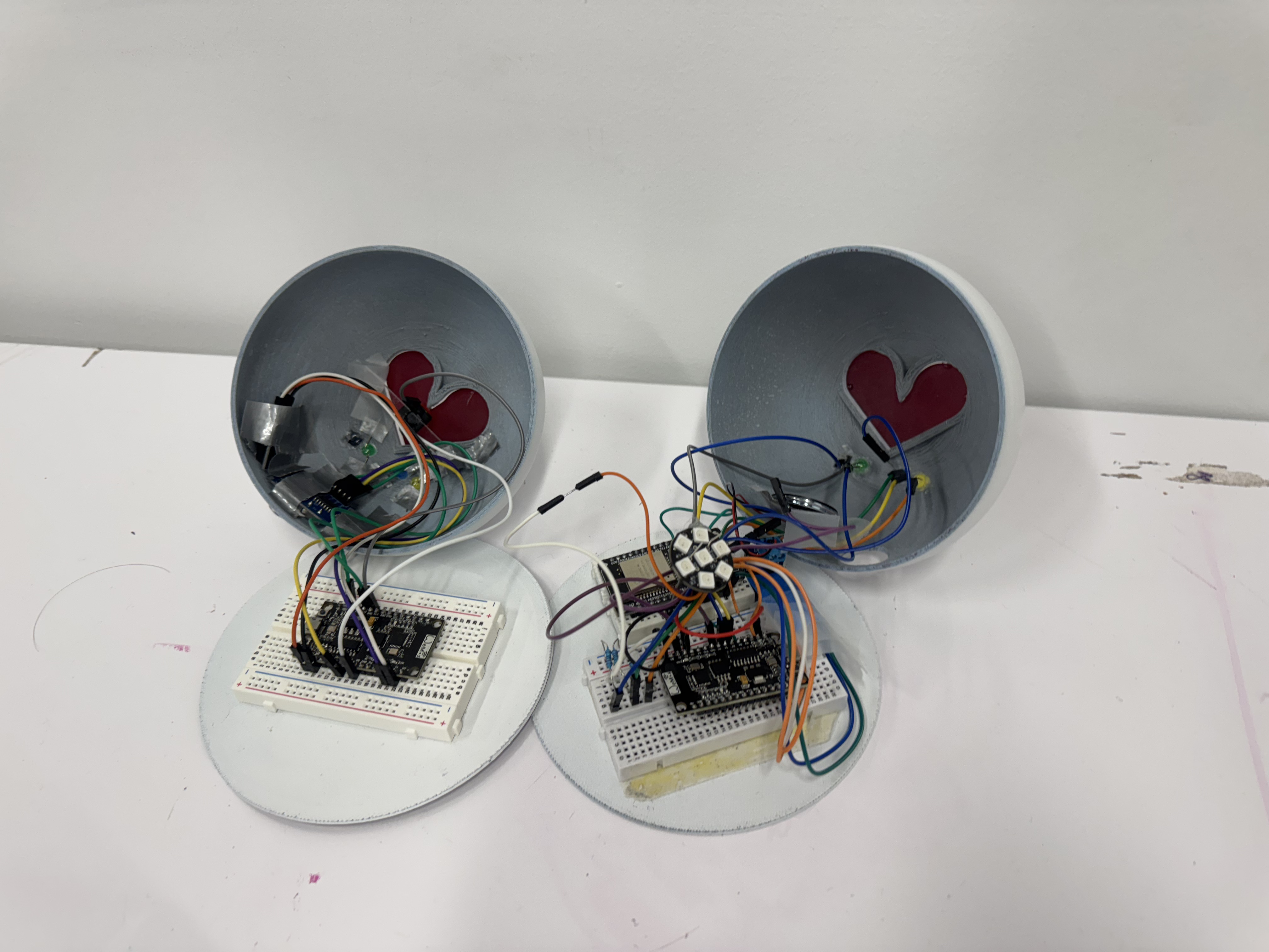
03 · Physical Prototype
lumo
A pair of connected desk companions — one for each person. The physical device is the core of the system: it handles passive, ambient awareness through light, proximity, and sound without requiring any deliberate action from either person.
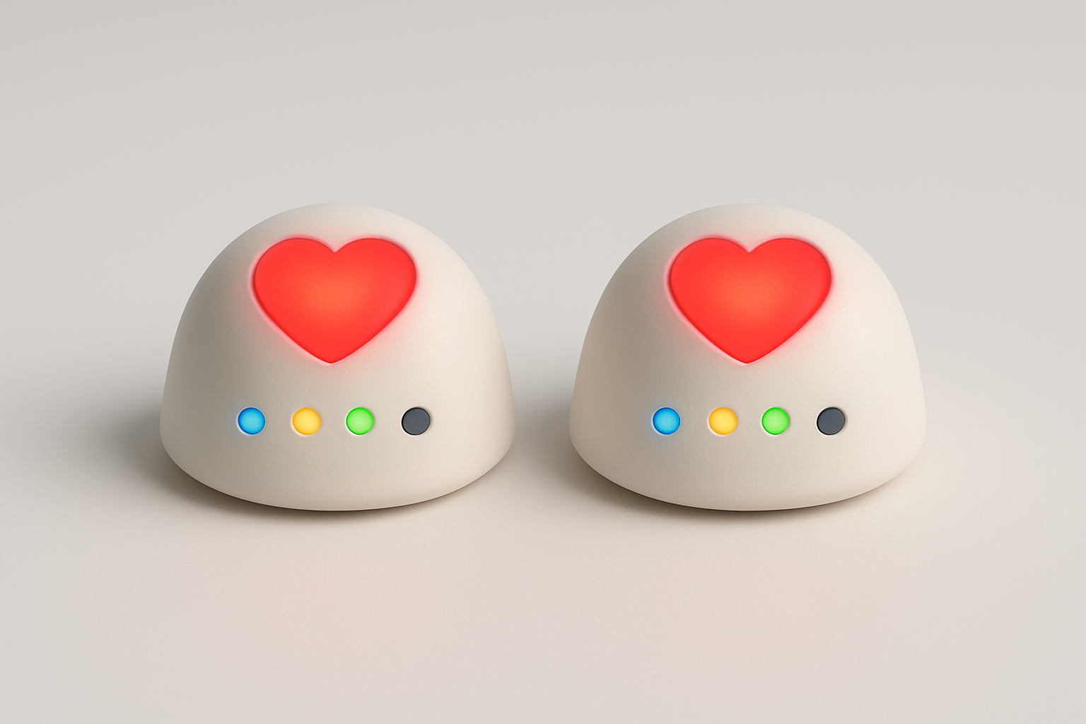
Four Interactions
Awareness
Day / night ambient light
Lumo tells you if your partner is in light or darkness. The light sensor reads their ambient light levels and transmits a day (yellow light) or night (blue light) signal to your device- no action required.
Communication
Voice note via the heart button
Record a voice note on the app, then tap the heart button to send it to your partner's Lumo. Their green LED turns on when a message is waiting, and they press a button to hear it play.
Emotional Presence
Proximity-based heart glow
When you sit at your desk and approach your Lumo, the proximity sensor triggers a heart glow on your partner's device. The closer your are, the brighter it glows. It signals: I'm here, at my desk, present.
Shared Connection
Synchronized heartbeat pulse
When a message is sent by you and received by the other within a span two minutes, the hearts on both devices pulse simultaneously, displaying a moment of shared presence across distance.
Building It
Starting from scratch
I came into this project with a software background — no prior experience with hardware, breadboards, or physical prototyping. A big part of this project was learning those fundamentals in real time while building something that actually had to work.
Firmware and ESP-NOW
The two devices communicate over ESP-NOW — a peer-to-peer Wi-Fi protocol that broadcasts directly between MAC addresses, no shared network or server needed. I worked on wiring the circuits, writing and testing the Arduino code, and debugging the sensor logic — including a proximity sensor that wasn't responding for multiple sessions, which turned out to be a wiring problem that kept looking like a code problem. My approach throughout: make a copy of the last stable file before touching anything, so failures could be isolated cleanly. Once communication was verified — a button press on one board lighting an LED on the other — I layered in the full interaction logic: proximity thresholds mapped to NeoPixel brightness, LDR readings translated to day/night states, and the two-minute co-presence timer.
CAD and finishing
The shell was modeled in CAD with cutouts sized for each component — functional without looking like ports on a piece of hardware. After 3D printing, I sanded, primed, and spray-painted it matte white. The finishing made a real difference. The raw print looked like a prototype; the painted version looked like a product.
04 · The App
Extending presence
into the digital layer
The companion app extends the physical device into message history, a shared timeline, and voice recording tools, bringing structure and pattern visualization to moments the hardware can only hint at.
Four Screens
hover to play ↑
01
Home Screen
Greets you by name with an indication of both users' current times. The inbox surfaces waiting voice notes, while a streak counter encourages sustained engagement.
02
Timeline View
A vertical timeline with a gradient shifting from blue (night) to gold (day), which shows both users' circadian contexts side-by-side. Voice notes appear as markers anchored to the time they were sent and received, so you start to see each other's rhythms.
03
Recording Screen
A clean waveform interface for recording voice notes. Start, stop, re-record, confirm, then send to device. The confirmation step, "your message is on its way", creates a sense of ritual and intentionality around each note sent.
04
Note History
A chronological log of incoming and outgoing notes that are saved for , playable directly from the list. A streak counter and streak-break warning add a gentle motivation layer to stay in the habit of checking in.
Visual Direction
I anchored the app's visual identity in blues and golds — colors that echo the day/night theme of the device and feel calm and slightly nostalgic. Instrument Serif Italic for expressive headers, Albert Sans for clean UI text. The result is something that feels warm without being saccharine, digital without feeling cold.

“The timeline started as a wireframe problem — how do you show two people's days side by side? It ended up being the heart of the app: a visual proof that your rhythms overlap, even across distance.”
05 · Design Decisions
The choices that shaped Lumo
From humanoid to ambient
Challenge
Early sketches had faces, arms, and expressive eyes. The feedback was clear: a human-like form makes users bond with the device itself, not through it to their partner.
Decision
I reframed the question — not "what should it look like?" but "what should it not look like?" The form simplified quickly: soft, rounded, faceless. Baymax was the reference: defined by light and warmth rather than features. The device became a vessel, not a character.
Simplifying the interactions
Challenge
Original designs included squeeze and handshake gestures, both requiring mechanical parts — too complex to build and too much to ask of users in daily use.
Decision
A mid-review push to cut anything non-essential led me to drop the squeeze entirely and reduce timezone syncing from a dynamic clock to a single binary LED — day or night. Simple enough to read at a glance, meaningful enough to change how you think before reaching out.
Designing the timeline
Challenge
How do you show two people's daily rhythms side by side without it becoming chaotic? Horizontal layouts failed immediately in informal testing — classmates with no context read them as calendars.
Decision
I landed on a vertical gradient approach and introduced one rule that simplified everything: you can't send a new message if you have an unread one waiting. It cleaned up the logic, removed a class of edge cases, and kept the exchange feeling balanced rather than broadcast-like.
Building the shell
Challenge
Every component placement had a functional constraint — where the proximity sensor needed to sit, how to route LEDs so they'd be visible without being distracting, how to size the heart cutout so the NeoPixel glow showed without revealing the ring itself.
Decision
I modeled the CAD with cutouts sized for each component, then sanded, primed, and spray-painted the print matte white. The raw print looked like a prototype; the painted version looked like a product.
06 · Limitations & Future
Where Lumo goes next
USB-powered only
Battery integration is the most critical next step. The USB cord fundamentally disrupts the 'just sit on your desk' fantasy.
No user testing
We validated ideas through feedback and casual checks, but never ran a proper long-term deployment study.
No haptic / warmth layer
Warmth and vibration were in our original vision but out of scope. They'd significantly deepen the emotional expressiveness without adding complexity.
The app has room to grow in directions the device can't. The timeline is currently a static record — but it could become predictive, surfacing patterns like “she's usually at her desk around 9am her time” and suggesting better windows to connect. The streak mechanic could evolve into something richer: shared rituals, recurring reminders, or a way to mark meaningful moments for both people to revisit.
“The bigger opportunity isn't a better messaging app. It's the space between messages — the ambient, automatic knowledge that the person you care about is still there.”